Why the Three Metrics Form One Tree, Not Three Dashboards
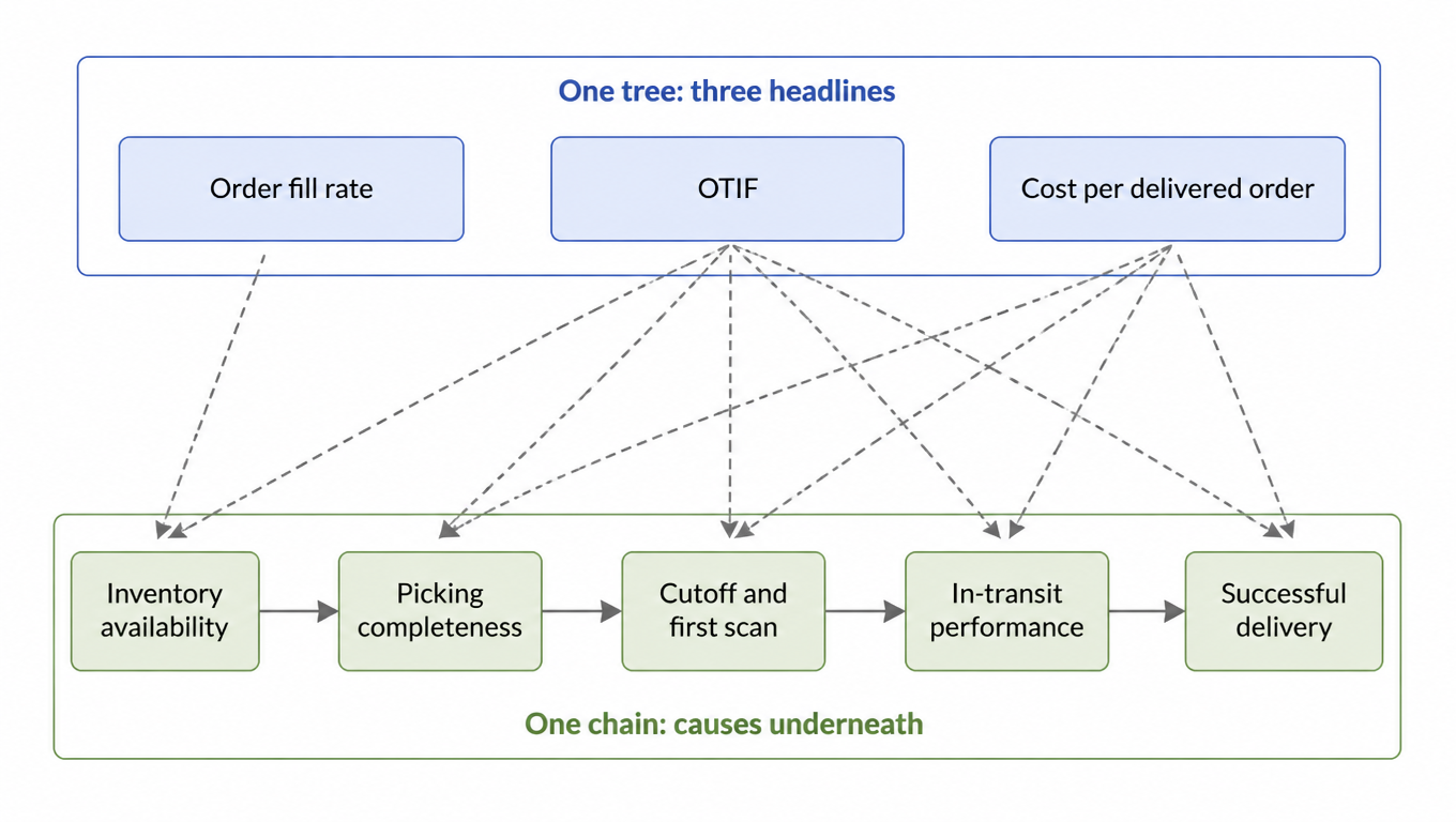
Each headline metric reads a span of the same journey. Order fill rate reads the promise: did we have the stock and ship the order complete? OTIF reads execution and transit: did the complete order leave on time and arrive by the promised date? Cost per delivered order prices the whole journey: labor, parcel spend, surcharges, and the failed attempts in between. Because the spans overlap, a movement in one headline number is usually caused upstream, in a stage that another metric owns. When OTIF is red while fill rate is green, the problem sits in release and execution, not in inventory. When cost is red while service is green, the problem sits in the rate card, the zone mix, or packaging, not on the warehouse floor. The metric that displayed the symptom is rarely the metric that caused it.
That asymmetry defines the diagnostic direction: when a top-level number moves, hunt upstream first. Top numbers are symptoms. The branch nodes are causes. The leaves are actions, and every leaf action has one owner: the brand, the 3PL, or the carrier. This is why the three metrics belong on a single tree. A dashboard shows each number by itself, which invites each side to defend its own number. A tree forces the question in the other direction: which branch moved, and which owner's leaf do we touch?
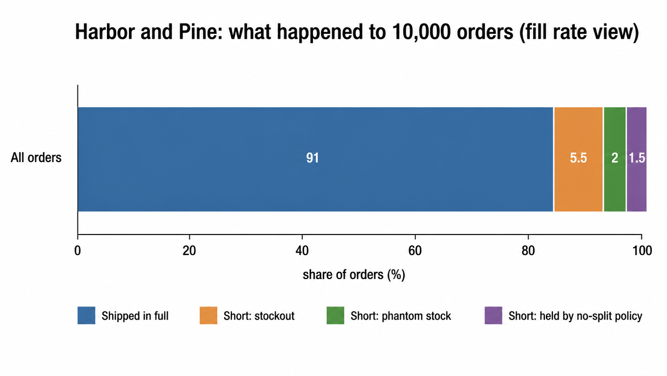
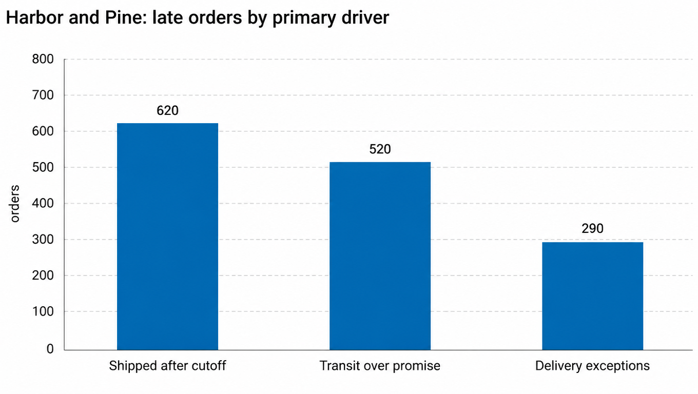
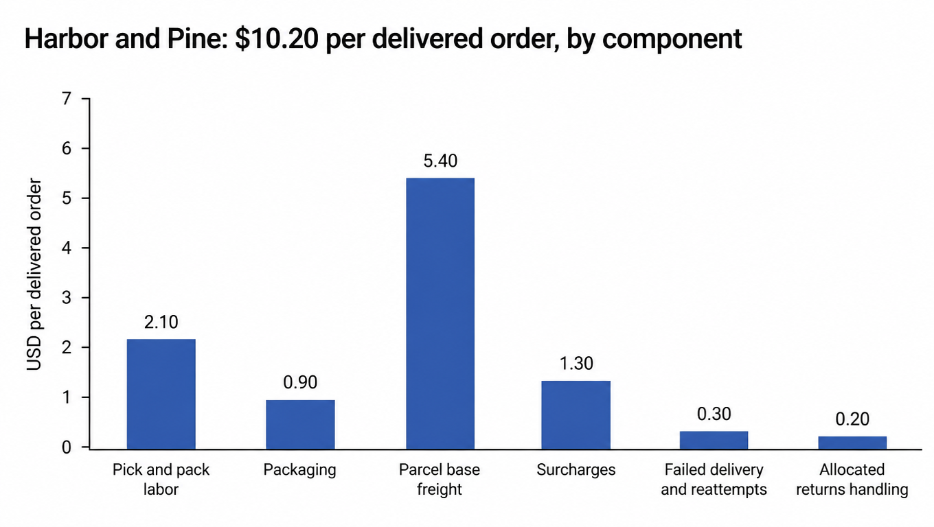
Harbor and Pine's baseline gives the tree something to diagnose. The brand sells candles, ceramics, and textiles from a single 3PL warehouse in the Midwest, with most customers on the coasts. Its current month reads 91% order fill, 78% OTIF, and $10.20 per delivered order. Management wants to reach 97% fill, an OTIF in the high 80s, and cost per delivered order at or below $9.40 within one quarter. Reaching that target is not a matter of pushing all three dials harder. It is a matter of finding, on the chain below, which stages are actually broken.