Carrier Management

How to Build a Carrier Performance Scorecard

Most fulfillment operations run not one carrier but a mix: a national heavyweight for volume, a regional player for speed, a budget last-mile network for the cheap lanes, sometimes a specialist for hazmat or oversized freight. Three to eight carriers is normal for both a 3PL serving multiple clients and a DTC brand shipping its own orders. And for most of those operators, carrier selection is still a gut call dressed up as a review. The sales rep with the best lunch wins a share. The carrier whose portal is easiest to log into gets more volume. Nobody can answer the question every quarter inevitably asks: which carriers are actually earning their share?

A carrier performance scorecard answers that question with numbers. It turns a vague feeling ("Carrier C feels slow lately") into a defensible figure ("Carrier C is 85% on time on this lane, 8 points below the next carrier, and its surcharges are 18% of its invoice"). This article shows you how to build one, with two tracks that share one data foundation: a lightweight daily score that drives per-order routing, and a full quarterly score that drives contract reviews and share allocation. You get the metric definitions, a complete worked example with three carriers over 30 days, and the Excel formulas to copy so it runs before the end of the week.

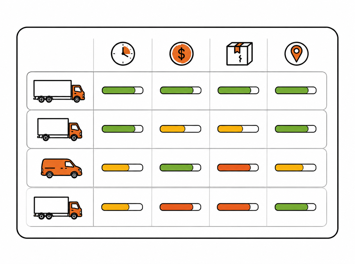
Carrier scorecards compare on-time delivery, cost, damage and tracking data quality with colored bars.
A scorecard turns feelings into defensible numbers, and that is the precondition for every carrier decision

Why Your Carrier Mix Needs a Scorecard

The moment you run more than one carrier, you have a selection problem on every single order. Which one gets this shipment? The default answers are all wrong in ways that compound. Picking by sticker rate ignores what the carrier actually charges once surcharges, fuel adjustments, and residential delivery fees land on the invoice. Picking by habit ignores that carriers change: routes get reorganized, hubs get congested, regional players get acquired and their service quality drifts. Picking by complaint volume ignores that complaints arrive weeks late, after the money is already spent and the customer already left a one-star review.

The real cost of the cheap carrier shows up off the invoice. The budget carrier at $5.50 a parcel looks like a steal next to $7.00 from the national player, until you add the surcharges, the claims for damaged goods, the late deliveries that trigger chargebacks from your marketplace, and the support hours spent answering "where is my package" tickets. On the worked example in this article, the cheapest carrier on the lane is also the worst on time, the worst on damage, and the worst on tracking data. The sticker price hides all of it.

There is a second, less obvious reason scorecards fail to exist: the data is scattered. On-time scans live in one carrier portal, invoices in another, claims in a third, and the truth about what you actually paid sits in the finance system. No single person in most organizations has all four views open at once, so nobody can see the trade-off. The scorecard forces the data into one table, which is the precondition for any decision worth making.

None of this requires expensive software. The data your carriers already send you through APIs and your TMS events can feed a single source table, and a well-built spreadsheet can do the scoring. The hard part is not the tooling, it is deciding what to measure and what the score means. That is what the rest of this article covers.

The Four Dimensions That Matter

Every carrier scorecard worth running measures the same four things, because every other KPI you could track is a symptom of one of them. Time: did it arrive when promised? Cost: what did it actually cost? Damage: did the parcel survive? Tracking: could you and your customer see what was happening?

DimensionWeightCore KPIs
On-time performance30%OTD (on-time delivery rate vs promised transit), average transit time vs promised transit
Cost30%Actual per-parcel cost including surcharges, invoice accuracy, claims cost ratio
Damage20%Damaged parcels per 1,000, claims rate by parcel count
Tracking data quality20%Scan completeness, first-scan delay, exception event accuracy

On-time performance is the customer-facing dimension. OTD is the share of parcels delivered by the promised date, and it must be measured against the promised transit time, not just the actual one. A carrier that quotes 5 days and delivers in 4 looks great on OTD, but you could have promised your customer 3. Track average transit time separately so the score rewards honest, tight promises rather than padded ones.

Cost is the dimension that reveals whether the sticker price is real. Actual per-parcel cost is total invoiced amount divided by volume, surcharges included. Invoice accuracy asks how often the bill matches the quote, and a carrier that pads invoices with unexplained fees should lose points even when the base rate is low. Claims cost ratio captures the financial bleed from damage and loss.

Damage and tracking data quality are the two dimensions that protect your brand and your support team. Damage per 1,000 parcels is easy to compare across carriers regardless of volume. Tracking quality, often ignored, is what your customers actually experience: a parcel that arrives on time but shows no scans for three days generates tickets and anxiety regardless of the final outcome.

The 30/30/20/20 split is an illustrative starting point, not an industry benchmark. A fragile-goods team can raise damage weight in its own model, while a time-sensitive operation can raise on-time weight. Recalibrate quarterly against actual loss costs and document the assumptions so quarter-to-quarter comparisons stay meaningful.

Two Tracks, One System

A common mistake is building one scorecard and forcing it to serve two different jobs. Daily routing needs something fast and reactive: does this carrier still meet the bar on this lane, right now? Quarterly review needs something complete and deliberate: across the full quarter, did this carrier earn its share, and what do we negotiate next quarter? One score does both jobs poorly. Two tracks solve it cleanly, as long as they share the same data.

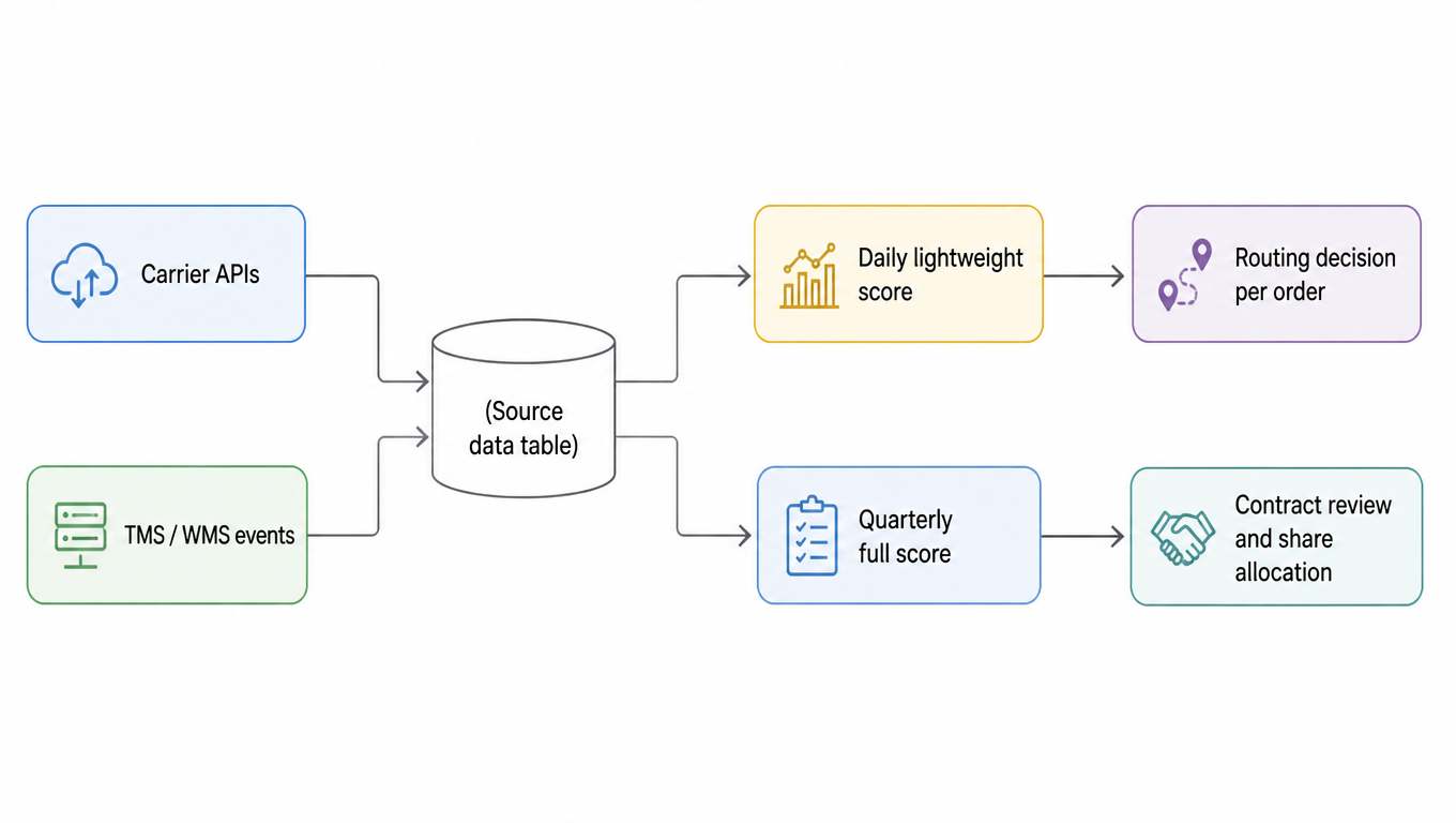
Flow diagram of the two-track system: carrier APIs and TMS/WMS events feed one source data table, which feeds both the daily lightweight score (routing decisions) and the quarterly full score (contract review and share allocation)
Two tracks, one source table: the daily score drives routing, the quarterly score drives contracts

The lightweight track is a projection of the full one, not a second system. Both read from the same source data table built from carrier APIs and TMS events. The daily score uses a rolling 30-day window and a handful of the most decision-relevant metrics, recomputed cheaply and often. The quarterly score uses the same source table with more dimensions, proper weighting, and a full 1-5 banding exercise. When the two disagree, which happens, the daily track wins for routing and the quarterly track wins for contracts, and you reconcile the difference in the monthly light review.

The payoff of the two-track design is that you never have to choose between speed and rigor. The routing engine gets fresh numbers every day. The contract review gets a defensible, weighted analysis every quarter. And because both sit on one source table, a carrier that quietly degrades in July is visible in the daily score immediately, not discovered in October when the quarterly report runs.

Building the Lightweight Daily Scorecard

The daily score exists to answer one question per order: does this carrier still qualify for this lane today? It needs to be computable from data that is already flowing in, at carrier-by-lane granularity, on a rolling window that smooths out single-day noise without hiding a real trend.

Start with a short list of real-time indicators, six is enough: OTD, average transit time, surcharge share of cost, damage per 1,000, first-scan delay, and exception rate. Each one maps to a column in the source table, so the daily score is a scheduled recompute, not a manual exercise. Score each indicator 1-5 against the same banding you use in the quarterly scorecard, then combine them with the same weights; the only difference is the window and the granularity.

Granularity is where most daily scorecards go wrong. Carrier performance varies enormously by lane. A carrier that is excellent on the West Coast corridor can be mediocre on cross-country freight, because the lanes run through different hubs and regional partners. Score at carrier-by-lane granularity, not carrier overall, or you will route orders onto a carrier that earned its score on a different route. The rolling 30-day window keeps the sample fresh: if a carrier only ships 10 parcels a day on a lane, 30 days gives you a few hundred data points, enough for the score to mean something.

The routing rule that comes out of the daily score is a gate, not a beauty contest: among carriers whose score clears the threshold on this lane, route to the lowest actual cost. The threshold is the quality floor you refuse to sell to your customers; the cost comparison among qualifiers is where you harvest the savings. A carrier below the threshold goes on hold for that lane until its rolling score recovers, and the hold is visible to whoever does the routing, which is the whole point. In the worked example below, the cheapest carrier on the lane fails the gate and loses the traffic, and the winner is the second-cheapest, not the cheapest. That is the scorecard doing its job.

Building the Full Quarterly Scorecard

The quarterly scorecard answers the bigger question: over the last three months, did each carrier earn the share it holds, and what changes do we negotiate? Where the daily track is reactive, this one is deliberate, and it is the document you bring to the carrier review.

Start by normalizing every KPI to a 1-5 band, either against an internal target (OTD of 95% and above is a 5) or against the peer set (the best carrier on the lane is a 5, everyone else is scaled relative to them). Banding against targets keeps the score absolute and stable across quarters; banding against peers makes the score relative and self-adjusting. Most operations want targets for on-time and damage, and peer-relative scoring for cost, because cost only means something compared to the alternatives.

Then weight the four dimensions exactly as the daily track does: on-time 30%, cost 30%, damage 20%, tracking 20%, or whatever your quarterly recalibration settled on. The composite score is on-time × 0.30 + cost × 0.30 + damage × 0.20 + tracking × 0.20. Roll the detail up in layers: carrier-by-lane scores first, then carrier overall, then a comparison against the previous quarter so you can see the trend, not just the level. A carrier at 3.8 that has climbed from 3.1 is a different conversation from one that fell from 4.5.

The output of the quarterly scorecard is a set of decisions, not a report. Share allocation: shift volume toward carriers whose composite score and cost justify more. Rate conversation: come to the negotiation with the score in hand, because a carrier that wants volume back needs to earn it in the score first. Performance improvement plan: for carriers below the floor, agree on specific, measurable fixes with a deadline, then re-score at the next review. The agenda for the review meeting should be: walk the trends, let each carrier dispute the data (they will find genuine errors, which is good), agree on the changes, and write the conclusions into the next quarter's contract terms so the scorecard has teeth.

Carry second-carrier pilot evidence into daily and quarterly reviews

Start from the low-risk pilot record and retain its scope and decision criteria. Resolve open pilot items first; a scorecard does not replace rollout acceptance.

Keep the daily and quarterly tracks above. After a second-carrier pilot, carry the same parcel, handoff, exception, and settled-cost records into the scorecard. Preserve the pilot’s client, facility, service, parcel segment, and scope version. Compare within these dimensions before aggregating; a change in client mix does not automatically indicate better carrier performance.

Keep metric definitions consistent from pilot to continuing review

Reconcile quotes, charges, and refunds after the first full billing cycle. Then review the segment monthly as a recommended cadence while retaining the existing full quarterly review. Track promise-based on-time performance, time to first scan, exception resolution time, cost per shipped parcel, cost per successful delivery, and quote-to-invoice variance. State each denominator, observation window, and missing-data treatment; show unsettled charges and unresolved exceptions separately.

Review decisionEvidence conditionAction record
MaintainThe current scope continues to meet the client promise and agreed cost boundary with complete evidence.Record the scope and next review date.
AdjustA problem is isolated to an explainable facility, ZIP, service, or parcel segment.Adjust that segment and revalidate coverage, handoff, and cost.
ExpandCurrent evidence is stable, the added scope has been validated, and owners approve.Change one scope dimension at a time and retain versions and rollback paths.
Pause new assignments or stop usePromise, cost, or recovery capability falls outside approved boundaries, or essential evidence remains unavailable.Restore an available original path and follow tendered parcels; distinguish stopping assignments from terminating a contract.

Keep pending verification visible when evidence is incomplete. An aggregate score must not hide unsettled invoices or missing first scans. Changes to client, facility, service eligibility, coverage version, or order mix should trigger coverage validation and final-cost review. Return to the entry evaluation checklist to record the decision, evidence, and next action.

Continue investigating cost and improvement

When scorecard cost movement needs explanation, use the cost diagnostic path to distinguish pricing, shipment mix, invoice adjustments, and failure burden. Continue with cost per successful delivery for delivery-related cost, keeping unsettled invoices and mix changes separate from carrier improvement.

Worked Example: 3 Carriers, 30 Days, One Decision

Here is the full example this article has been referencing. Lane: USPS Priority alternative, from your West Coast warehouse to the East Coast region. Three carriers, 30 days of data. Carrier A is the national heavyweight, Carrier B is a regional player, Carrier C is the budget last-mile network.

Raw data, 30 days, one lane:

CarrierVolumeOn-timeOTDAvg transitPromisedTotal costSurchargesDamagedClaimsFirst scan
Carrier A3,0002,85095.0%3.1 days3.0 days$21,000$1,80021150.4 days
Carrier B1,8001,63891.0%3.6 days3.5 days$10,800$6001291.2 days
Carrier C2,4002,04085.0%4.5 days4.0 days$13,200$2,40033272.0 days

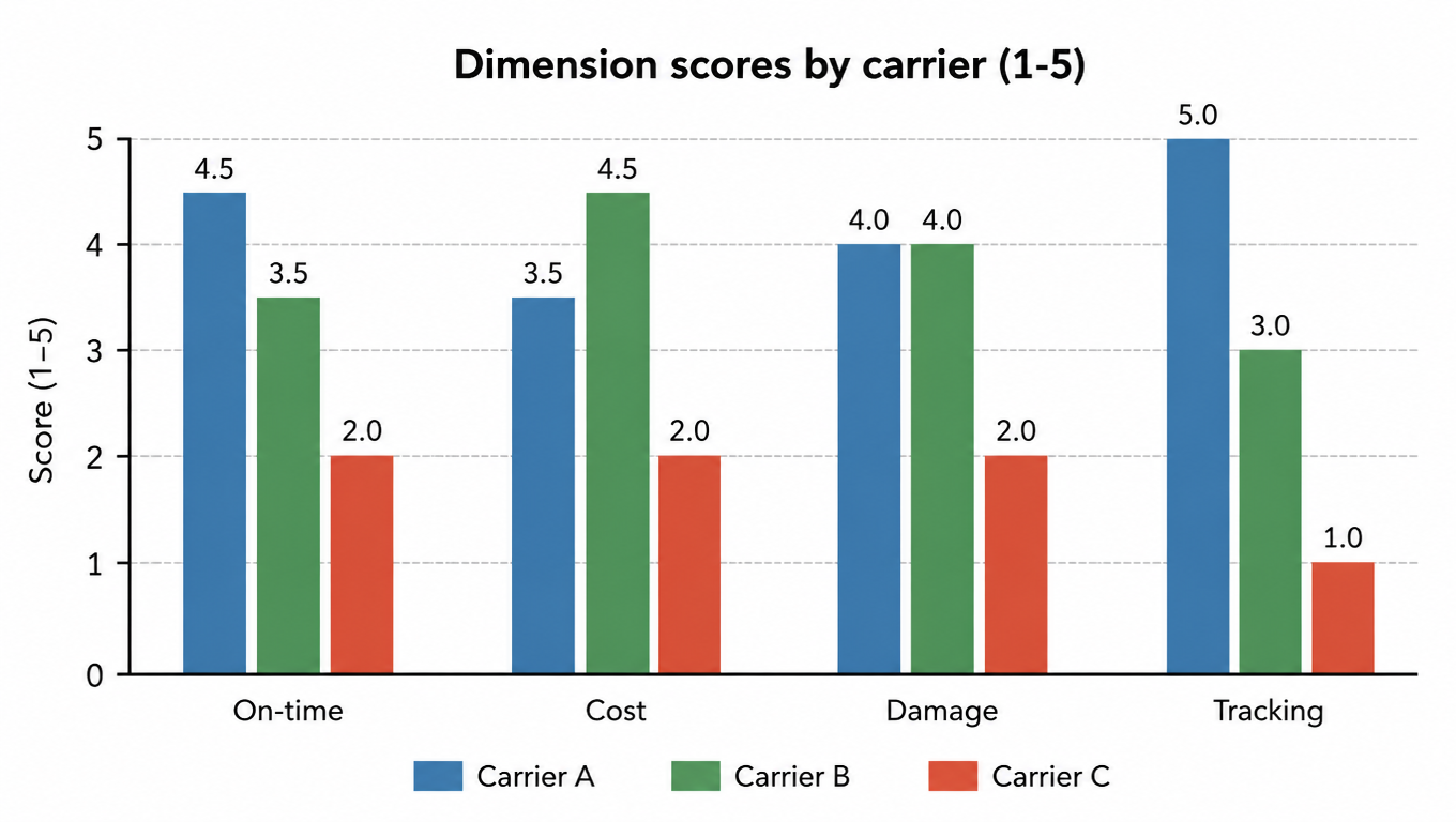
The derived numbers matter as much as the raw ones. Actual per-parcel cost: A is $7.00 (21,000 ÷ 3,000), B is $6.00, C is $5.50. Surcharge share: A 8.6%, B 5.6%, C 18.2%. Damage per 1,000: A 7.0, B 6.7, C 13.8. Claims rate: A 0.5%, B 0.5%, C 1.1%. Carrier C is the cheapest on the sticker and the most expensive in every other column.

Banded scores (1-5) per dimension:

CarrierOn-timeCostDamageTrackingComposite
Carrier A4.53.54.05.04.20
Carrier B3.54.54.03.03.80
Carrier C2.02.02.01.01.80

Composite = on-time × 0.30 + cost × 0.30 + damage × 0.20 + tracking × 0.20. Carrier A leads at 4.20 on quality, Carrier B sits at 3.80 with the best cost score, Carrier C collapses to 1.80 because its only advantage, the sticker price, is wiped out by surcharges and claims in the cost dimension and it is worst everywhere else.

Grouped bar chart of dimension scores (1-5) by carrier: Carrier A on-time 4.5, cost 3.5, damage 4, tracking 5; Carrier B 3.5, 4.5, 4, 3; Carrier C 2, 2, 2, 1
Carrier C's only advantage, the sticker price, is wiped out by surcharges and claims

Now run both tracks on the same data. Daily routing, with a qualification threshold of 3.5: Carrier A and B clear it, Carrier C does not and goes on hold for this lane. Among the qualifiers, route to lowest actual cost: Carrier B at $6.00 wins the daily traffic. The cheapest sticker price in the group, Carrier C, gets nothing. Quarterly review with the same numbers: Carrier A's 4.20 composite says it earns premium consideration for customers who need the tightest SLA, Carrier B is the volume workhorse, and Carrier C enters a performance improvement plan with specific targets (OTD above 90%, surcharge share below 10%, first scan under 1 day) and a re-score at the end of next quarter before any share is restored. Same source data, two decisions, one system.

The Excel Template: Formulas You Can Copy

Three sheets, one source table, no manual scoring. The layout below matches the worked example, so you can type in the sample numbers and watch the scores land before you swap in your own data.

Sheet 1: Raw data. One row per carrier per day, with columns: Date, Carrier, Lane, Volume, On-time, Transit days, Promised days, Cost, Surcharges, Damaged, Claims, First scan delay (days). Everything else in the workbook reads from this sheet, so the discipline is: get the raw rows in, and the scorecard runs itself.

Sheet 2: KPI. One row per carrier × lane, 30-day rolling window. Formulas use SUMIFS and AVERAGEIFS so a new day of raw data updates the KPI automatically:

KPIFormula (Carrier A, Lane L1)
OTD=SUMIFS(OnTimeParcels, Carrier,"A", Lane,"L1") / SUMIFS(Volume, Carrier,"A", Lane,"L1")
Actual cost per parcel=SUMIFS(Cost, Carrier,"A", Lane,"L1") / SUMIFS(Volume, Carrier,"A", Lane,"L1")
Surcharge share=SUMIFS(Surcharges, Carrier,"A", Lane,"L1") / SUMIFS(Cost, Carrier,"A", Lane,"L1")
Damage per 1,000=SUMIFS(DamagedParcels, Carrier,"A", Lane,"L1") / SUMIFS(Volume, Carrier,"A", Lane,"L1") * 1000
Claims rate=SUMIFS(Claims, Carrier,"A", Lane,"L1") / SUMIFS(Volume, Carrier,"A", Lane,"L1")
Avg transit days=AVERAGEIFS(TransitDays, Carrier,"A", Lane,"L1", Date,">="&TODAY()-30)
First scan delay=AVERAGEIFS(FirstScanDelay, Carrier,"A", Lane,"L1", Date,">="&TODAY()-30)

Replace the column names in quotes with your actual column references, and add the same Date filter to the SUMIFS formulas if your raw sheet spans more than 30 days.

Sheet 3: Scorecard. Band each KPI to 1-5, then weight the dimensions. The OTD banding with internal targets looks like this: =IF(B2>=0.95,5,IF(B2>=0.92,4,IF(B2>=0.88,3,IF(B2>=0.85,2,1)))). Build one such formula per KPI with your own target bands. Composite score: =G2*0.3+H2*0.3+I2*0.2+J2*0.2, where G, H, I, J are the on-time, cost, damage, and tracking dimension scores. Ranking: =RANK(G2, $G$2:$G$4). Daily gate: =IF(G2>=3.5,"eligible","hold"). All of these reproduce the worked example exactly, so a correct setup shows Carrier A at 4.20, Carrier B at 3.80, Carrier C at 1.80, and only C on hold.
Pitfalls That Kill Scorecards

Every scorecard fails in one of four predictable ways, and they are all preventable. The first is gaming the metrics. If you score only OTD, the carrier's response is to pad its promised transit time, which makes OTD look great while your customers get slower service. This is why the scorecard always pairs OTD with average transit time versus promised, so loosening the promise hurts the score on the second metric. Watch for the same dynamic in any single-metric design.

The second is small samples and lane structure. A lane with 50 parcels a month will swing wildly from quarter to quarter, and a carrier that looks terrible in October may just have had a bad week on a thin lane. Handle it with confidence floors: below a minimum volume on a lane, either widen the window or suppress the score and route on carrier-overall numbers instead. The third is stale weights. The 30/30/20/20 that fits peak season does not fit the quiet quarter: during the holidays, on-time and damage dominate customer complaints, while cost matters more in the off-season. Recalibrate weights quarterly, and record what you changed and why, so next quarter's comparison stays honest.

The fourth pitfall is the scorecard that becomes a spreadsheet nobody opens. If the data has to be re-entered by hand, if the daily score needs a person to run it, if the quarterly review is not on the calendar, the scorecard dies of neglect. The fixes are boring and mandatory: automate the data flow so the source table fills itself, run a 15-minute light review monthly to catch trends before they become problems, run the full review quarterly with the carriers in the room, and write the agreed share and PIP targets into the contract so the scorecard has real consequences. A scorecard with no teeth is a report. A scorecard with teeth is a routing engine and a negotiation weapon, and that is the one worth building.

Key Takeaways

  • A scorecard measures four things: on-time, cost, damage, and tracking data quality, starting at 30/30/20/20 and recalibrated quarterly.
  • Build two tracks on one source table: a daily lightweight score for per-order routing, a full quarterly score for contract reviews and share allocation.
  • Score at carrier-by-lane granularity, not carrier overall; use a rolling 30-day window and confidence floors for thin lanes.
  • The routing rule is a gate: among qualifiers, route to the lowest actual cost; the cheapest sticker price does not always win the traffic.
  • Pair OTD with average transit time versus promised so carriers cannot game the metrics, and write conclusions into the contract so the scorecard has teeth.
  • A three-sheet Excel workbook is enough: feed the raw data in, let SUMIFS/AVERAGEIFS compute the KPIs, and band with IF formulas before weighting the composite.

FAQ

One scorecard struggles to serve two different jobs well. Daily routing needs a fast, reactive number: does this carrier still qualify on this lane today. Quarterly review needs a complete, deliberate weighted analysis. Both tracks read the same source table, differing only in window, granularity, and depth, so they stay consistent at low cost.
Yes. The data already exists, it is just scattered across carrier portals, invoices, and finance systems. You can start by keying it into one source table by hand, but make automation the goal, or the daily score will die of manual maintenance. Getting the scorecard running first, then automating the data flow, beats waiting for a perfect data source.
Single-metric scorecards always get gamed. The classic move is padding promised transit time to make OTD look great while customers get slower service. The counter is to always pair OTD with average transit time versus promised, so loosening the promise hurts the score on the second metric. Letting carriers dispute the data at the quarterly review also surfaces gaming.
Use a confidence floor for small samples. When a lane falls below a minimum volume, either widen the window or suppress the lane score and route on carrier-overall numbers instead. A bad week on a thin lane is not a trend; do not let statistical noise misjudge a good carrier.
Quarterly, using the actual cost structure of your losses. The 30/30/20/20 that fits peak season does not fit the quiet quarter: on-time and damage dominate complaints in the holidays, while cost matters more off-season. Record what you changed and why, so quarter-over-quarter comparisons stay honest.
Should a second carrier be reviewed again after passing its pilot?

Yes. Reconcile charges and refunds after the first full billing cycle, review performance by segment, and revalidate after changes to client, facility, service, coverage version, or order mix.